DESCRIPTION:
After time exploring media and learning about information design, you will
now develop an infographic that presents a series of different processes
as visuals rather than text.
REQUIREMENT:
Your main intention is to analyse the “delivery mechanism’s” that affect
the outcomes of your infographics. Though content is important, however
the aim of this presentation is too look at what makes an infographic
presentation work or does not work. This includes content but only as one
of the many components of an infographic:
PART 1: Infographic poster (20%)
INSTRUCTION:
1. Choose 1 infographic poster design (that is not well design) from
Internet
2. Redesign the poster into A4 size. Sketch the idea and process (5 Marks)
3. Redesign and simplify the poster based on visual hierarchy &
typography (5 Marks)
4. Simplify the poster's design based on color, shape & pattern (5
Marks)
5. Attach your final poster on E-Portfolio with explanation and reflective
writing (5 Marks)
PART 2: Minimal animated infographic (20%)
INSTRUCTION:
1. Animate your infographic poster into one static loop animation page
2. Loop duration in between 15 - 30 second
3. Size: 1080 x 1920 px (Vertical Video) upload to your own Youtube
channel
PART 1: Infographic Poster (20%)
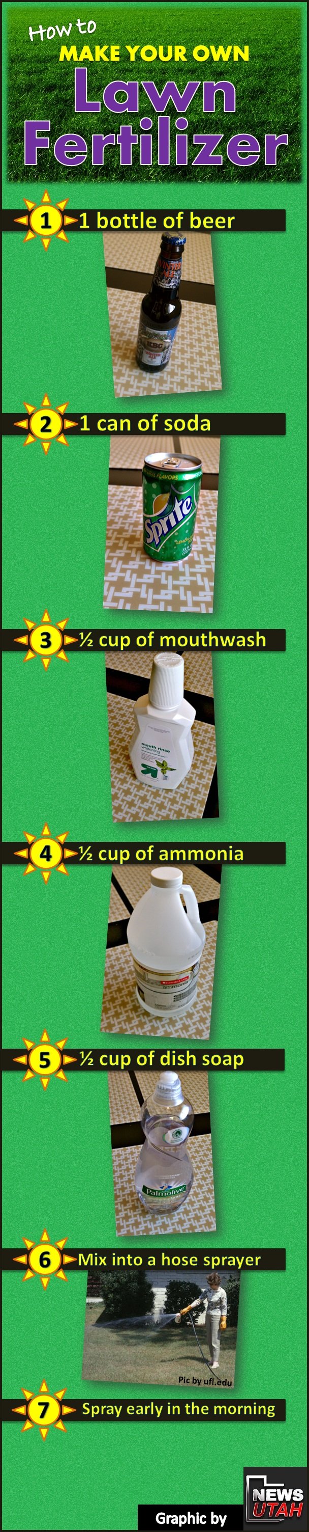
ORIGINAL INFOGRAPHIC POSTER
The original infographic uses real photographs, bright saturated colors,
and a cluttered layout. Although the steps are presented in a sequence
(1-7), the visual hierarchy is weak because:
-
There are too many competing colors (yellow, green, purple, bright
cyan).
- Real photos create inconsistent lighting and perspective.
-
Text is thin and sometimes hard to read against the green background.
-
Some ingredients such as ammonia are not safe for public DIY lawn use,
which decreases reliability.
The original design seems to rely more on decoration than on clarity, and
its instructional purpose is visually overshadowed by intense color
choices.
REDESIGN SKETCH
The sketch phase simplifies the information using:
- Minimal line-art icons
- Clear grouping of ingredients
- A more logical top-to-bottom reading flow
- Simplified titles and consistent text placement
Fig. 3.1.2, Simplified Redesign Sketch
This stage focuses on reorganizing content structure before focusing
on color and style. The sketch helps solve problems from the original:
-
Too many steps: condensed into clear three main application steps.
-
Too many unnecessary ingredients: only the essential four remain.
-
Consistency in icon style improves readability and reduces cognitive
load.
I also reimagined the poster size into A4 as instructed.
FINAL POSTER
The final poster demonstrates a complete visual redesign based on
information-design principles:
a. Visual Hierarchy
Titles, ingredients, and steps are clearly separated using section blocks:
- Top section: Title + tagline
- Middle section: Ingredients
- Bottom section: Application guide
This helps guide the viewer's eye in a predictable, clean sequence.
b. Color Choice
A calm, natural green palette replaces the bright neon tones in the
original. This improves readability (giving it better contrast),
consistency (one palette instead of five), and aesthetic quality (looks
more clean, modern, and professional).
c. Icon-Based Ingredients
Instead of real photos with inconsistent lighting, simplified icons make
the information universal and easier to process. Icons also help on
reducing distractions, allows faster visual recognition, and creates a
cohesive graphic language.
d. Simplified Instructions
The steps are now limited to the essential actions: mix, pour, apply.
This makes the infographic easier for users to follow.
e. Typography Choice
1. Clean Sans-Serif for Clarity (Poppins) - Legibility
I switched to a simple sans-serif typeface for all the text (title,
headings, and body) because sans-serif fonts are easier to read on screens
and at small sizes. The original design used loud, decorative fonts that
looked dated and competed with the images. A clean sans-serif matches the
idea of simple DIY instructions and supports the "guide" feeling instead
of looking like an advertisement.
2. Strong, Bold Title for Hierarchy
"HOME GROWN LAWN ENHANCER" is:
-
Bold and all caps: creates a clear entry point and immediately
tells the viewers what the poster is about.
-
Centered at the top, with generous spacing: makes it feel
stable and important.
This gives the poster a clear visual hierarchy: title, subheading,
section headings, body text.
3. Lighter Weight for Subheading & Body
The subheading ("Simple D.I.Y Steps for a Healthier Yard") and the body
text uses a lighter weight of the same font, mixed-case (not all caps),
and possesses a slightly smaller size. This contrast in weight (bold vs
regular) and case (caps vs sentence-case) helps separate information
levels without changing fonts, keep the overall look consistent and
calm, make long sentences easier to read.
4. Consistent Section Headings
"MATERIALS YOU'LL NEED" and "APPLICATION GUIDE" are all caps, bold,
slightly larger than body but smaller than the main title. This gives
each section a clear label and makes the layout easy to scan. Viewers
can quickly see what they need and how to do it.
5. Simple Numeral for Steps
The step numbers (1, 2, 3) are large, clear numerals, has the same type
style as the rest of the poster. This keeps the steps easy to follow in
order, visually tied to the rest of the design, avoids the "cartoony"
sun-shaped icons from the original, making it more
straight-forward.
6. Overall Typographic Goal
Overall, my typography choices aim to improve legibility (especially on
screen and in animation), establish a clear hierarchy from title to
details, create a modern trustworthy look that matches the natural,
eco-theme of lawn care, and keep everything visually consistent by using
one font family with different weights instead of many random
fonts.

Fig. 3.1.3, Final Infographic Poster (A4 Size)
Why I Removed Ammonia from the Ingredients List:
I removed ammonia from the redesigned infographic for three important
reasons:
1. Safety Concerns


.png)
.png)
.png)
.png)
.png)


Comments
Post a Comment